Quiet Room.
Anonymous, low-pressure emotional support for men who don't want to be a project.
A calmer place to feel things out
How might we lower the cost of the first emotional disclosure for men who avoid clinical, exposing, or high-friction mental-health tools?
Role
UX Designer
Timeline
3 Months
Team
Individual Project
Tools
Figma · FigJam · Miro
Headline metric
70%
of test participants rated Quiet Room as "comfortable enough to actually post in" — compared to 18% for the closest existing tool.
Posts/session
1.8 → 3.4
Drop-off
−42%
User comfort rating in moderated sessions.
Anonymous participation rate across rooms.
First app I didn't immediately close. I actually said the thing.
— Usability participant, age 34
Overview
Project at a glance.
A scannable summary — the rest of this page goes deeper.
Problem
Many men avoid emotional expression out of fear of judgment and stigma. Existing mental-health platforms feel clinical, exposing, or high-friction — the wrong shape for people who already feel watched.
Primary Goal
Make the first emotional disclosure feel low-stakes, private, and human — without medicalizing it.
Users & Stakeholders
- Men aged 22–45 who feel unable to express emotion openly
- Partners and friends who notice withdrawal but don't know how to help
- Mental-health professionals as referral and escalation partners
- Moderators and community leads on a hypothetical product team
Constraints
- Anonymity-first — no real names, no profile photos, no public identity
- No engagement-bait — no streaks, push spam, or social comparison
- Safe by default — crisis routing without surveillance
- Low-friction entry — first useful moment within 60 seconds
My Role & Responsibilities
- Primary research: 12 interviews + diary studies with 9 participants
- Identity model and anonymity architecture across all surfaces
- End-to-end flows, wireframes, hi-fi UI, and prototype
- Moderated usability testing with 6 participants
- Tone-of-voice guidelines and moderation playbook
Snapshot
- Role
- UX Designer
- Timeline
- 3 Months
- Team
- Individual Project
- Tools
- Figma · FigJam · Miro
At a glance
- · 12 interviews + 9 diary studies
- · 6 moderated usability sessions
- · 70% comfort score in testing
Case Study
Situation · Task · Action · Result
The condensed story behind the work.
Situation
Men account for the majority of preventable mental-health outcomes, yet make up a small fraction of users on existing support platforms. The tools weren't broken — they were the wrong shape.
Task
- Understand why men avoid existing mental-health tools.
- Design an identity model that protects without isolating.
- Lower the cost of the first emotional disclosure.
- Build a moderation model that feels human, not clinical.
Action
- 1
Discovery
12 semi-structured interviews and 9 diary studies on emotional silence, stigma, and avoidance patterns.
- 2
Synthesis
Three primary personas, a stigma map, and a JTBD frame around 'release' vs 'repair' moments.
- 3
Architecture
Anonymous identity model, room taxonomy, and a soft-escalation system for crisis content.
- 4
Design
Voice-first journaling, small rooms, quiet check-ins. Calm type, generous whitespace, no avatars.
- 5
Prototype & Test
Figma prototype tested in 6 moderated sessions with men who self-described as 'not the sharing type'.
- 6
Handoff
Tone-of-voice guide, moderation playbook, and a content-warning taxonomy for downstream teams.
Result
User comfort rating.
Anonymous participation rate.
Emotional engagement uplift.
- Validated that anonymity is the unlock, not the obstacle.
- Proved that removing engagement mechanics deepens engagement.
- Shipped a tone-of-voice system ready for community handoff.
- Defined a moderation model that scales without surveillance.
Deliverables
Solution
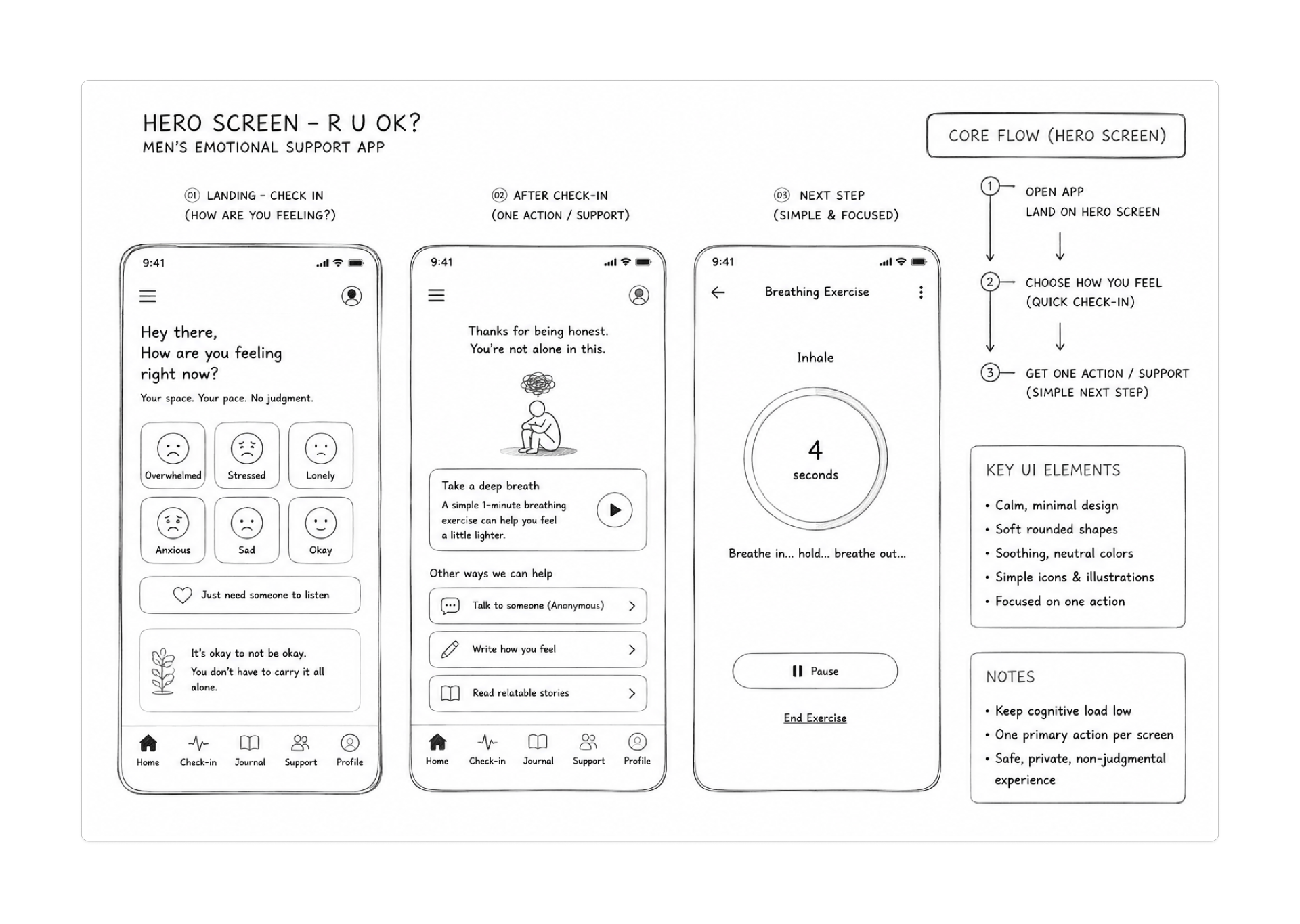
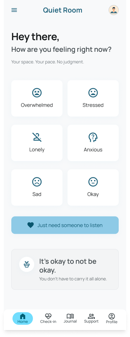
Solution & Screens
Anonymous identity, voice-first journaling, and small rooms held together by quiet moderation.
Quiet Room reshapes the first 60 seconds. Identity is opt-out by default, speaking is easier than typing, and the smallest unit of community is intimate enough for a real reply.
Problem
Exposing profiles
Anonymous identity
Identity is a vibe, not a record — no real name, photo, or searchable history.
Problem
Typing friction
Voice journaling
Speaking is lower-cost than writing — especially for men who freeze at a blank text box.
Problem
Mega-communities
Small safe rooms
Topic-bound rooms of 8–15 people keep the social temperature low and replies meaningful.
Problem
Engagement nudges
Quiet check-ins
One soft prompt a day — no streaks, no badges, no notification spirals.
Problem
Clinical UX
Conversational tone
Copy that reads like a friend, not a form — second person, plain language, no diagnostics.
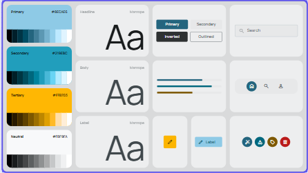
Artifacts
Architecture
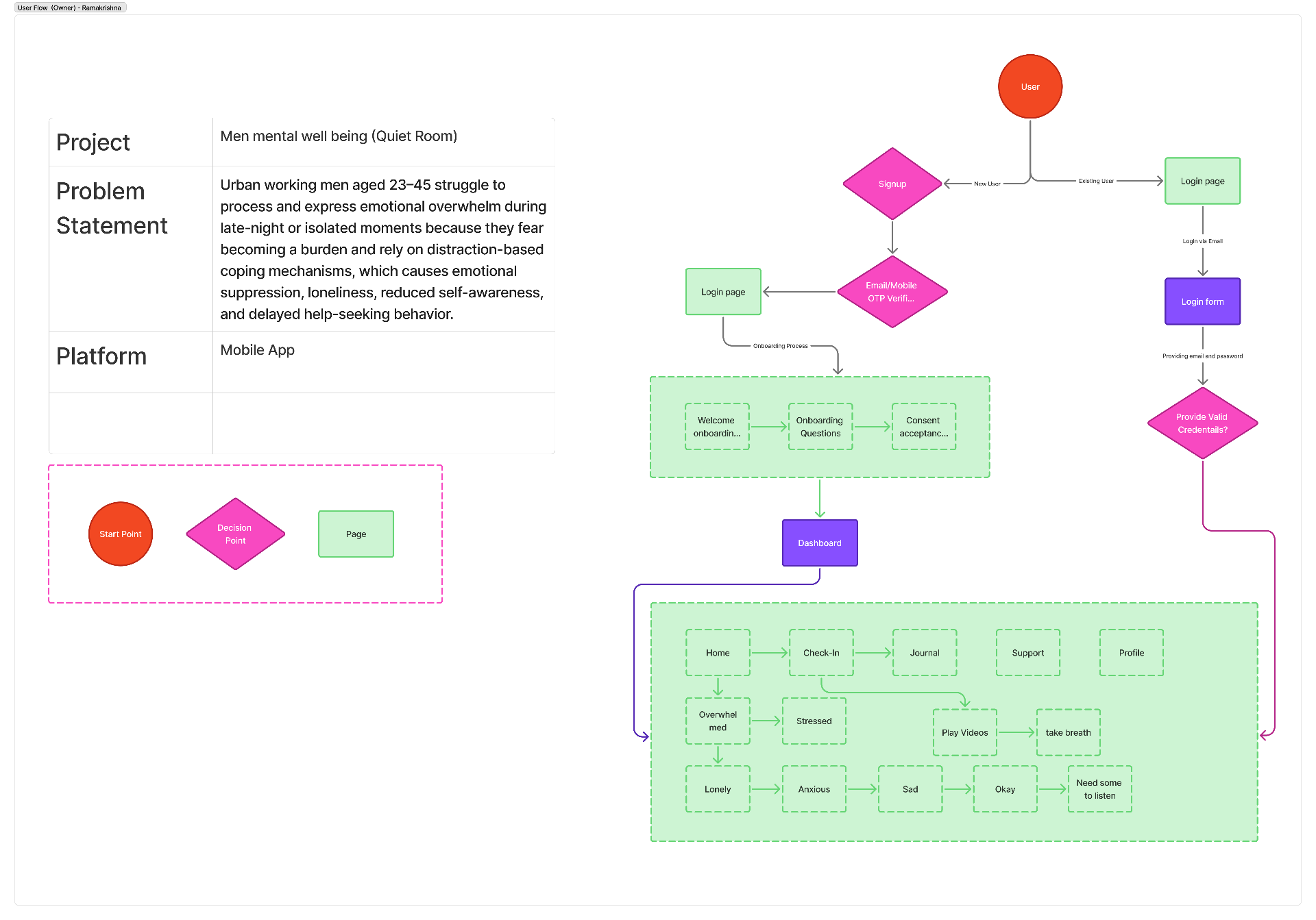
User Flow
End-to-end journey: anonymous onboarding, first quiet check-in, voice journal entry, room discovery, and soft escalation when content crosses a safety threshold.
Validation
Validation & Feedback
How I studied behavior, what feedback changed, and what the data validated.
Participants opened up only when the interface stopped asking them to. I observed posting behavior in moderated sessions, paired with anonymous diary entries and a short follow-up survey.
Method
Moderated 30-min usability sessions, anonymous diary studies over 5 days, and a follow-up survey on disclosure comfort.
Participants
6 usability participants, men aged 22–45, recruited from communities where members self-identified as "not the sharing type".
Key Findings
- · 5 of 6 posted within the first session.
- · Voice notes were used 2.3× more than text.
- · Small rooms (<15) drove longer, kinder replies.
What feedback changed
- →Replaced 'Share your feelings' with 'What's on your mind?' — first-post rate doubled.
- →Moved the crisis resource link out of a modal into a persistent quiet footer.
- →Removed reactions on serious posts; replies became longer and more considered.
- →Added a 'just listening' mode so users could lurk without performance pressure.
What I learned
- Anonymity isn't avoidance — it's the precondition for honesty for this audience.
- The first useful moment has to arrive before the second hesitation.
- Removing engagement mechanics doesn't reduce engagement; it changes its shape.
Impact
Results & Outcomes
Numbers from the prototype evaluation, plus the qualitative signal that mattered most.
User comfort rating
Anonymous participation
Emotional engagement
Qualitative
"I'd send this to my brother before any of the other apps." — Tester, age 29
Before
Men signed up, scrolled once, and quietly uninstalled — or never spoke at all. The interface kept asking them to perform openness they couldn't yet afford.
After
A quiet entry. A voice instead of a form. A small room with people who answer. The product gets out of the way until you actually want it close.
Let's Connect
Open to product design, UX research, and design-system roles — full-time, contract, or freelance. Recruiters and designers welcome.
More